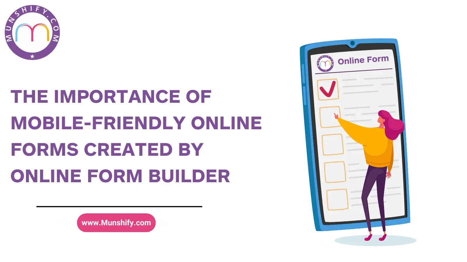

In today’s digital age, mobile devices have become integral to our daily lives. As a result, businesses must ensure that their online presence is optimized for mobile users. One crucial aspect of this is the creation of mobile-friendly online forms. Using an Online Form Builder can significantly streamline this process, making it easier for businesses to cater to their mobile audience efficiently. In this blog, we will explore the importance of mobile-friendly online forms, the challenges of non-mobile-friendly forms, and how an Online Form Builder can be a game-changer.
Tabel of Content
- Challenges of Non-Mobile-Friendly Forms
- Benefits of Mobile-Friendly Online Forms
- How Online Form Builders Help
- Features to Look for in an Online Form Builder
- Best Practices for Creating Mobile-Friendly Forms
Challenges of Non-Mobile-Friendly Forms
- Poor User Experience: Non-mobile-friendly forms are often difficult to navigate on smaller screens. Users may need to zoom in and out to read the text or fill out fields, leading to frustration and a high abandonment rate.
- Decreased Conversion Rates: If users find it challenging to complete forms on their mobile devices, they are less likely to convert. This can result in a significant loss of potential leads or sales.
- Higher Bounce Rates: When users encounter non-mobile-friendly forms, they are more likely to leave the site immediately, increasing the bounce rate and negatively impacting SEO.
- Incompatibility Issues: Non-mobile-friendly forms may not function correctly on all devices, leading to submission errors and incomplete data collection.
- Lower Engagement: Users are more likely to engage with a site that offers a seamless mobile experience. Non-mobile-friendly forms can deter users from interacting with your brand.
Benefits of Mobile-Friendly Online Forms
- Improved User Experience: Mobile-friendly forms provide a smooth and intuitive user experience, encouraging users to complete and submit the form.
- Higher Conversion Rates: When forms are easy to fill out on any device, conversion rates naturally increase, boosting lead generation and sales.
- Wider Reach: Mobile-friendly forms ensure that you can reach a broader audience, as they are accessible on all devices.
- Enhanced Data Collection: Users are more likely to complete mobile-friendly forms accurately, leading to better data quality and more reliable insights.
How Online Form Builders Help
- Responsive Design: An Online Form Builder ensures that forms are automatically optimized for all devices, providing a consistent user experience.
- Customizable Templates: With an Online Form Builder, you can choose from a variety of templates designed specifically for mobile compatibility.
- Drag-and-Drop Interface: Online Form Builders often feature a user-friendly drag-and-drop interface, making it easy to create and customize forms without coding knowledge.
- Real-Time Preview: Online Form Builders allow you to preview how your form will look on different devices, ensuring it meets your standards before going live.
- Integration Capabilities: Many Online Form Builders integrate seamlessly with other tools and platforms, enhancing your overall workflow and data management.
Features to Look for in an Online Form Builder
- Mobile Responsiveness: Ensure the Online Form Builder offers responsive design capabilities.
- Ease of Use: Look for a user-friendly interface that allows for easy form creation and customization.
- Template Library: A good Online Form Builder should offer a wide range of templates catering to different needs and industries.
- Customization Options: The ability to customize forms to match your brand’s look and feel is essential.
- Integration Options: Choose an Online Form Builder that integrates with your existing tools and platforms.
- Analytics and Reporting: Advanced analytics and reporting features can provide valuable insights into form performance and user behavior.
Best Practices for Creating Mobile-Friendly Forms
- Keep It Simple: Use a clean, straightforward design with minimal fields to reduce friction.
- Use Large Input Fields: Ensure that input fields are large enough to be easily tapped on a mobile screen.
- Optimize Load Times: Fast loading times are crucial for mobile users. Optimize images and reduce unnecessary elements.
- Provide Clear Instructions: Use concise, easy-to-understand instructions and labels.
- Test Across Devices: Regularly test your forms on various devices and browsers to ensure consistent performance.
- Use Conditional Logic: Implement conditional logic to show or hide fields based on user input, making the form more dynamic and user-friendly.
In conclusion, the importance of mobile-friendly online forms cannot be overstated in today’s mobile-first world. Using an Munshify Online Form Builder is a powerful way to create forms that are not only functional but also optimized for mobile devices. By addressing the challenges of non-mobile-friendly forms and leveraging the benefits and features of an Online Form Builder, businesses can enhance user experience, improve conversion rates, and ultimately achieve greater success in their online endeavors. Ensuring your forms are mobile-friendly is a crucial step in maintaining a competitive edge in the digital marketplace.
Know more about Munshify Form Builder.